
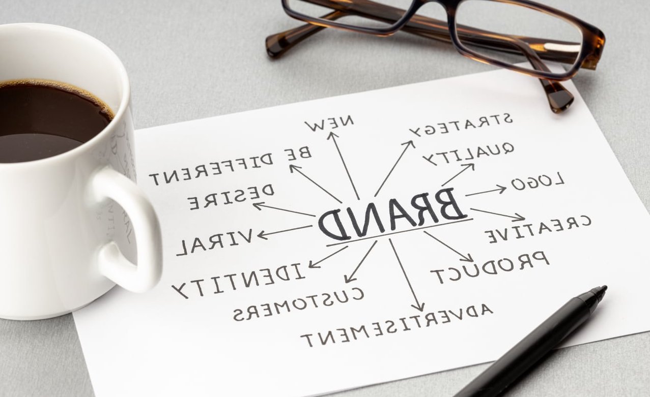
Most brand style guides are written like marketing brochures. They talk about mission, vision, audience personas, and brand voice. That’s fine for the marketing team, but it does very little for the one asset that gets abused the most: the logo.
At Same Days Forever, we treat the style guide as what it actually is in practice: a logo protection document. If you are a designer wondering how to create a brand style guide that real-world vendors, printers, and junior designers will actually respect, this 7-section template is for you.
Why Your Style Guide Should Be Built Around the Logo
A logo is the single most reproduced element of any brand. It ends up on business cards, pixelated favicons, embroidered polos, vinyl truck wraps, and slide decks built by interns at 11 PM. Every one of those touchpoints is an opportunity for misuse.
A traditional brand book assumes goodwill and design literacy from the reader. A logo-centric style guide assumes the opposite: that whoever opens this PDF needs to be told exactly what they can and cannot do, with visual proof.
Here’s the difference in one table:
| Generic Brand Book | Logo Protection Guide |
|---|---|
| Starts with mission and values | Starts with logo construction |
| Shows the logo once on a hero page | Defines every approved variant |
| Mentions “keep it consistent” | Shows 8+ misuse examples |
| Color swatches only | Color values for print, web, screen, fabric |
The 7-Section Logo-First Style Guide Template
Here is the exact structure we use on client projects. Each section has a specific job and a specific page count target.
Section 1: Logo Anatomy and Construction
Before you tell anyone what to do with the logo, show them what it is made of. This section dissects the mark.
- Wordmark, symbol, and lockup labeled clearly
- Construction grid showing geometric ratios (helpful for engravers and signage vendors who may need to rebuild at large scale)
- Reference to the original vector file format (SVG or AI master)
This page is rarely read by marketers but is essential for production partners.
Section 2: Clear Space and Minimum Sizes
This is where most logos start to suffer. Clear space rules tell the world how much breathing room your mark needs.
The X-height method works best: use a measurable element from inside the logo itself (often the height of the letter “o” or the symbol’s height) as the unit of clear space. This way the rule scales automatically.
Define minimum sizes for:
- Digital: minimum pixel width (typically 24px for favicons, 80px for full lockup)
- Print: minimum millimeter width (typically 15mm for full lockup)
- Embroidery and engraving: a separate, larger minimum because thin strokes disappear
Section 3: Approved Logo Variants
List every legal version of the logo. If a variant is not in this section, it does not exist.
- Primary full color
- Monochrome black
- Monochrome white (reversed)
- Single color brand
- Horizontal lockup
- Stacked lockup
- Icon only (for app icons, social avatars, favicons)
For each, include the filename, the recommended background, and the use case. Treat this like a library catalog.
Section 4: Color Values (All of Them)
This is where most style guides cut corners. Listing just HEX and CMYK is not enough in 2026. A logo that lives in physical and digital worlds needs every color space documented.
| Color Space | Use Case |
|---|---|
| HEX | Web, email, CSS |
| RGB | Screens, video, presentations |
| CMYK | Offset and digital print |
| Pantone (Coated & Uncoated) | Spot color print, packaging |
| RAL | Signage, industrial paint, vehicle wraps |
| Thread codes | Embroidery (Madeira, Isacord) |
Yes, include thread codes if the brand will ever exist on a uniform or merchandise. You will save your client hours of back-and-forth with suppliers.
Section 5: Typography in Relation to the Logo
Typography is usually presented as a standalone section, but in a logo-first guide it should be framed around how type interacts with the mark.
- Logo font: what was used to draw the wordmark (often outlined and not for general use)
- Primary brand typeface: for headings and body copy alongside the logo
- Secondary or system fallback: for environments where the brand font cannot load (email signatures, Word docs)
- Pairing rules: minimum spacing between the logo and any accompanying headline
Section 6: Misuse Examples (The Most Important Section)
If you only have time to do one section well, do this one. Misuse pages stop more bad design than any other part of a style guide because they are visual, specific, and impossible to misinterpret.
Show at least 8 to 10 explicit “Do Not” examples, each with a red X and a short caption. Common ones to include:
- Do not stretch or distort
- Do not rotate
- Do not change the colors
- Do not add drop shadows, glows, or bevels
- Do not place on low-contrast backgrounds
- Do not place on busy photography without a container
- Do not rearrange the lockup elements
- Do not recreate or re-type the wordmark
- Do not crop the logo
- Do not outline or add strokes
Use real renderings, not abstract diagrams. The more painful the example looks, the more memorable the rule becomes.
Section 7: Co-Branding and Endorsement Rules
Often forgotten and often where logos get destroyed. Define how the logo appears next to partner logos, sponsor lockups, parent company marks, and event branding.
- Required divider (usually a vertical rule at a specific weight)
- Equal optical weight rule for partner logos
- Hierarchy rules when used as a sponsor
- Approval contact: who signs off on any co-brand use
That last point matters. A style guide that does not name a guardian is a style guide that gets ignored.

File Delivery: What to Hand Over With the PDF
The style guide PDF is the rulebook. The asset package is the toolkit. Deliver both together in a single folder structure:
- /01_Guide with the PDF and an editable source (Figma, InDesign)
- /02_Logos sorted by variant, each in SVG, PNG (transparent, multiple sizes), EPS, and PDF
- /03_Fonts with license info
- /04_Colors with ASE and ACO swatch files for Adobe tools
- /05_Templates for common deliverables (social, email signature, letterhead)
Common Mistakes Designers Make
- Skipping the misuse section because “it’s negative.” It’s the most useful page in the document.
- Using only HEX values. Your logo will end up on a t-shirt eventually. Plan for it.
- Writing in designer jargon. The audience is often a marketing assistant or a print vendor, not another designer.
- Making the PDF 80 pages long. Nobody reads it. Aim for 20 to 30 focused pages.
- Forgetting to date and version the document. Always include a version number and a contact for the latest file.
FAQ
How long should a brand style guide be?
For a logo-focused guide, 20 to 30 pages is the sweet spot. Anything shorter usually skips misuse examples. Anything longer tends to get ignored.
What software should I use to build a brand style guide?
Figma is excellent for collaborative guides that need updates. InDesign remains the standard for polished PDF deliverables. For interactive or web-based guides, Notion and Frontify are growing options in 2026.
Do I need a brand style guide for a small business?
Yes, even a 5-page mini guide covering logo variants, clear space, color values, and three misuse examples will save the business from inconsistent vendor work later.
What is the difference between a brand book and a style guide?
A brand book covers the strategic side (mission, values, voice, audience). A style guide covers the visual rules (logo, color, type). Many companies combine them, but separating them keeps each document focused and usable.
How often should a style guide be updated?
Review it annually. Update it whenever a new logo variant is approved, a new color is added, or a new touchpoint emerges (a new product line, a new market, a rebrand of a sub-brand).
Final Thought
A brand style guide is not a portfolio piece. It is an operations document. When you build it around the logo and treat it as a protection tool rather than a storytelling vehicle, you give the brand something that actually survives contact with the real world: vendors, printers, freelancers, interns, and the inevitable 11 PM slide deck.
Build the 7 sections above, deliver the file package alongside, and you will have created a style guide that does its job long after the launch announcement is forgotten.