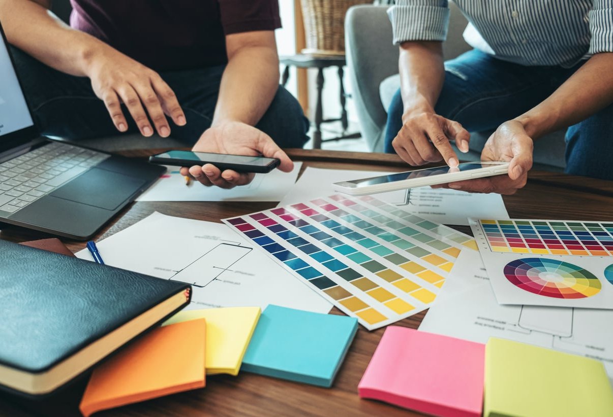
Most logo revision rounds are not caused by bad design. They are caused by two people picturing two different things and never saying it out loud. A logo mood board fixes that. It is the cheapest alignment tool in a brand identity project, and it works best when you build it before a single sketch exists.
This is the exact 6-step process we use at Same Days Forever to gather references, sort them by tone rather than looks, and reduce the board down to something a client can sign off on in one meeting.
What a Logo Mood Board Actually Is (and What It Is Not)
A logo mood board is a curated visual document that defines the feeling, tone and visual territory of a logo before any design work starts. It usually contains reference marks, typography samples, color swatches, textures, and short written notes explaining why each element is there. Background reading: https://logogeek.uk.
What it is not:
- Not a Pinterest dump. Fifty saved images with no logic is a collection, not a board.
- Not a logo preview. If the client can point at one reference and say “do that”, your board is too literal.
- Not a decoration exercise. A pretty grid that nobody can explain is worthless in a feedback meeting.
- Not the client’s taste board. It reflects the brand’s audience, not the founder’s personal favorites.
Why the Board Cuts Revision Rounds
Every argument you have at the concept stage costs one round of revisions. Every argument you have at the mood board stage costs one email. The board moves subjective conversations forward in the timeline, when changing direction is free.
| Stage where disagreement happens | Typical cost to fix | What changes |
|---|---|---|
| Mood board | 15 minutes | Swap a few reference images |
| Concept presentation | 1 to 2 days | Redraw full concepts |
| Refinement | 3 to 5 days | Rebuild the direction from scratch |
| After delivery | Full project restart | Applications, files, rollout |
Step 1: Run a Tone Interview Before You Collect Anything
Do not open Pinterest yet. If you gather references before you know the tone, you will simply collect your own taste and then try to sell it.
Ask the client a short set of questions and write the answers down verbatim:
- Describe your brand as if it were a person walking into a room. How do they speak?
- What should a customer feel in the first three seconds of seeing your logo?
- Name three brands you admire, and tell me why, not which one looks nicest.
- Name one brand in your industry you never want to be compared to.
- Where will this logo live most often? App icon, storefront, packaging, invoice?
Turn Answers Into Three Tone Words
Pull three adjectives from the interview and get them confirmed in writing. Not five, not ten. Three. For example: warm, precise, unfussy. Those words become the filter for every image you add later, and they become the language you use in the approval meeting.
Push back on vague words. “Modern”, “clean” and “professional” mean nothing on their own. Ask “modern like what?” until you get something with an edge to it.
Step 2: Gather Wide, Fast and Without Judgement
Now you collect. The goal at this stage is volume, not quality. Aim for 60 to 100 references in one or two focused sessions. Do not curate while collecting, it slows you down and biases you toward your usual style.
Where to Pull References From
- Logo archives and design galleries for mark construction and typographic detail
- Pinterest boards for broad visual territory, kept as a private board so the client does not see the raw dump
- Photography and texture sources for material feeling, paper, metal, fabric, light
- Physical world, shop signage, packaging, book covers, transport signage, museum wayfinding
- Competitor and adjacent industries, so you know what the category already looks like
Include Non-Logo References on Purpose
A logo mood board built only from other logos produces derivative work. Mix in:
- Typography specimens and lettering details
- Color combinations found in photography rather than a generated palette
- Materials and print finishes
- Editorial layouts and grid systems
- One or two “anti-references” showing what to avoid

Step 3: Sort by Tone, Not by Aesthetics
This is the step that separates a useful board from a pretty one. Most designers group references by how they look, all the geometric marks together, all the serif logos together. That grouping tells the client nothing about the brand.
Instead, group by the feeling each reference triggers. Take your 60 to 100 images and drop each one into a tone bucket. If an image does not fit any bucket, it is out. The team at milanote.com reached a similar conclusion.
| Sorting by aesthetics (weak) | Sorting by tone (strong) |
|---|---|
| Sans serif wordmarks | Quiet confidence, says little, means a lot |
| Bold color blocks | Energetic and slightly disruptive |
| Hand-drawn marks | Made by a person, small batch, human |
| Monoline icons | Technical, engineered, dependable |
| Muted palettes | Calm, unhurried, premium without shouting |
The Practical Sorting Method
- Create one column per tone word from Step 1, plus one column called “strong but off-brief”.
- Move every reference into a column in under three seconds each. Speed prevents overthinking.
- Any image you hesitate on goes into “off-brief”. You are not deleting it, just parking it.
- Count each column. If one tone word has three images and another has forty, your tone words are unbalanced and need a conversation with the client.
The “strong but off-brief” column is valuable. If it fills up fast, your brief may be wrong, or your instincts are pulling somewhere the client has not considered. That is a discussion worth having before you sketch, not after.
Step 4: Cut Down to a Focused Board
A board with 40 images gives the client 40 opinions. A board with 12 gives them a direction.
Target 9 to 15 elements on the final logo mood board. A workable split:
- 3 to 4 logo or mark references showing construction and weight
- 2 to 3 typography samples
- 1 color strip with 4 to 6 swatches
- 2 to 3 texture, material or photographic references
- 1 to 2 layout or application examples
- Optional: 1 anti-reference clearly labelled as a direction to avoid
Cutting Rules That Work
- Kill duplicates of feeling. If two images say the same thing, keep the stronger one.
- Remove anything you cannot explain in one sentence. If you cannot justify it, the client will challenge it.
- Remove direct competitors. Putting a competitor’s logo on the board invites imitation.
- Remove anything too finished. A reference that already looks like a complete brand identity becomes the client’s expected outcome.
- Check contrast. The board should feel coherent but not monotonous. If everything is beige, you have a palette, not a direction.
One Board or Two?
Two boards representing two distinct directions can work well, provided both are genuinely viable. Never present three or more. Beyond two, clients start mixing and matching elements across boards, which is exactly the mess you built the board to prevent. If you do present two, name them (“Workshop” and “Institute”, for example) so the conversation has vocabulary.
Step 5: Annotate Everything
An unlabeled logo mood board is a Rorschach test. The client will read whatever they want into it and then be surprised by your concepts.
Add a short caption to every element, ideally 5 to 12 words, that names the attribute you are pointing at:
- “Note the generous letter spacing, it reads as calm”
- “Heavy stroke weight for legibility at 16px app icon size”
- “Warm off-white, avoids the coldness of pure white”
- “Referenced for the joint construction, not the illustration style”
That last type of caption is the most important one on the board. It tells the client which part of the image you care about, and prevents “we do not want a bird in our logo” comments.
Add a Short Written Header
Above the visuals, place the three tone words and two or three sentences describing the intended direction in plain language. Many approvals happen because of that paragraph, not the images.
Step 6: Present It for a Real Approval
Do not email the board and hope. Walk the client through it live, in 15 minutes, then get written sign-off. Mood board examples for brand inspiration covers this in more depth.
- Restate the brief in their own words from Step 1. This proves you listened.
- Present the tone words and get a yes on those before showing images.
- Walk the board element by element, explaining the why for each. Do not let them scan silently.
- Ask targeted questions: “Which single element on here feels most like you?” and “Which one feels wrong?” Those two answers are worth more than general feedback.
- Swap, do not rebuild. If something is wrong, replace two or three elements rather than starting over.
- Get it in writing. A simple email confirmation that the board represents the agreed direction is enough.
The Sentence That Saves You Later
When you present concepts, open with: “Here is how each concept connects back to the board you approved.” Feedback then becomes a discussion about execution against agreed criteria rather than personal preference. That single reframing is where the revision savings come from.
Tools for Building a Logo Mood Board
| Tool | Best for | Watch out for |
|---|---|---|
| Milanote | Ready-made logo moodboard templates with notes and swatches | Free plan limits the number of items |
| Figma or FigJam | Full layout control and easy client commenting | Infinite canvas invites clutter, set a frame size |
| Adobe Express | Fast free templates for a clean export | Templates can look generic if untouched |
| Step 2 gathering only, keep boards private | Never present a raw Pinterest board to a client | |
| Canva | Non-designer clients contributing their own references | Default fonts and stock images weaken the board |
| Physical board | Print, packaging and material-led brands | Hard to share with remote stakeholders |
Five Mistakes That Undo the Whole Exercise
- Building the board after you have already sketched. It becomes a justification document, and clients can smell it.
- Including the client’s competitor. You will be asked to “do something like that but different”, which is not a brief.
- Skipping color reasoning. Dropping a palette with no explanation guarantees a color argument in round two.
- Letting the client add images unsupervised. Invite their references, but you decide what makes the final board and you explain why.
- Making the board so beautiful it outshines the concepts. The board is a reference tool, not a portfolio piece.
Quick Checklist Before You Send the Board
- Three agreed tone words appear at the top
- Between 9 and 15 elements, no more
- Every element has a caption explaining the why
- Typography, color, texture and application are all represented
- No direct competitor logos
- At most two directions presented
- A clear approval request with a date
FAQ
What should a logo mood board include?
Three tone words, 3 to 4 logo or mark references, 2 to 3 typography samples, a color strip of 4 to 6 swatches, 2 to 3 texture or material references, and 1 to 2 application examples. Every item should carry a short caption explaining what it is there to demonstrate.
What is an example of a mood board?
For a neighborhood bakery with the tone words warm, handmade, unfussy, the board might hold a hand-painted shop sign, a chunky serif specimen, a flour-dusted wooden surface, a warm off-white and burnt orange palette, a stamped paper bag, and a simple monogram with visible brush texture. Each with a caption on why it belongs.
How many images should be on a logo mood board?
Between 9 and 15 on the final version. You will gather 60 to 100 during research, but presenting all of them shifts the curation job onto the client and multiplies the feedback you have to process.
Should the client help build the mood board?
Ask them to send 5 to 10 references with a sentence each explaining what they like about it. Then you curate. Their input reveals expectations early, but the final selection and the reasoning stay with you.
Does a mood board really reduce revision rounds?
Yes, because it moves subjective disagreement to a stage where fixing it costs minutes rather than days. When concepts arrive, feedback is measured against an approved direction instead of personal taste, which shortens the conversation considerably.
Can I use a free logo mood board template?
Yes. Templates from tools like Milanote, Adobe Express or Figma community files save layout time. Just replace every placeholder and add your own captions, because the value sits in the curation and the reasoning, not the grid.
Should I show the mood board to the client before or after concepts?
Always before. A mood board shown after concepts reads as a defense of work already done. Shown before, it is a shared agreement that gives both sides a reference point for every decision that follows.
Final Word
A logo mood board is not a creative warm-up. It is a contract about tone, written in images. Spend the extra hour sorting references by feeling rather than by style, cut the board to something a client can hold in their head, and explain every single element. The time you invest before sketching is time you do not spend redrawing.